팔레트·재질·선 두께·장식 밀도를 고정해 서로 다른 리소스가 한 세계에 속하게 합니다.
REVSTUDIO BOOK GAME ASSET FIELD GUIDE · 01
게임 리소스는 한 장의 그림이 아니라 규칙으로 만든다
UI는 플레이 중에 읽혀야 하고 캐릭터는 카메라 안에서 살아야 합니다. 역할·표시 크기·실루엣·상태·광원을 먼저 정하면 AI 결과가 같은 게임의 규칙 안으로 들어옵니다.
Core rule
게임에서 자연스럽다는 것은 현실과 닮았다는 뜻이 아니라, 같은 세계의 제작 규칙을 반복한다는 뜻입니다.
UI는 해상도와 안전 영역을, 캐릭터는 게임 카메라와 화면 점유율을 먼저 지정합니다.
생성 이미지는 방향을 합의하는 시안입니다. 벡터·위젯·모델·리깅은 제작 단계에서 다시 만듭니다.
Prompt comparison
같은 과제, 여섯 가지 실제 결과
UI와 캐릭터 각각에서 설명 부족형, 형용사 과잉형, 제작 명세형을 한 번씩 생성했습니다. 화려함이 아니라 게임 안에서의 읽힘과 재제작 가능성을 비교합니다.
OpenAI image generation
3:2 · 총 6장 · 각 1회
3:2 · 총 6장 · 각 1회
UI / HUD · 장식보다 정보 구조
same brief · three prompt strategies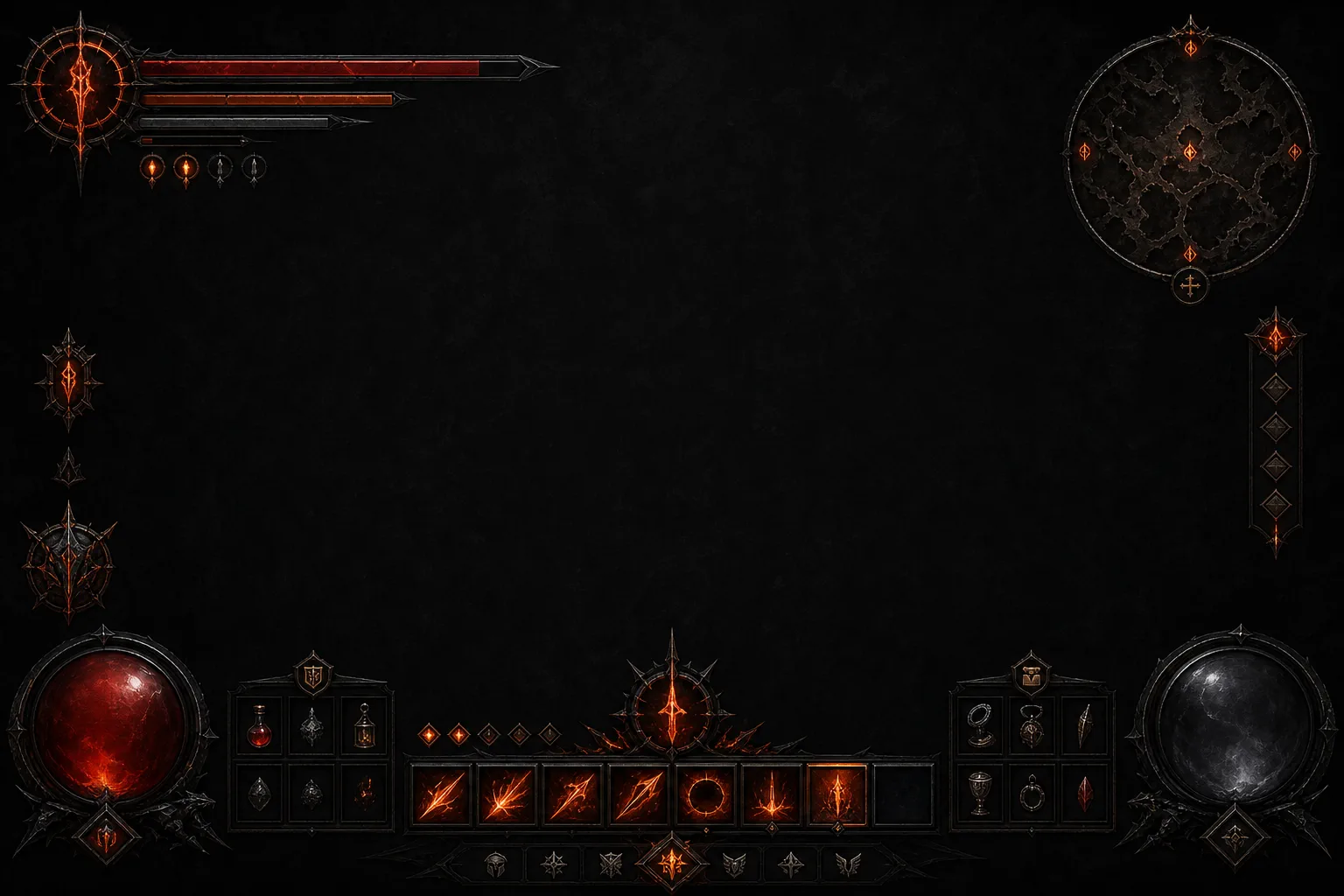 01
01
키워드만 입력
구조를 모델의 기본값에 맡기기
요소 목록만 주면 슬롯 수·간격·우선순위가 임의로 늘어납니다. 분위기는 맞아도 재사용 가능한 컴포넌트 규칙은 남지 않습니다.
실제 입력 프롬프트 보기
Create a single 1536 by 1024, 3:2 landscape image. A full-screen HUD for an original dark-fantasy action RPG, with health bars, ability icons, item slots and a minimap, dark medieval style, charcoal and ember-orange colors. Use only blank label areas and simple non-alphabetic glyph-like placeholders. No readable text, letters, numbers, logo, watermark, border, comparison layout, device frame, perspective mockup, or existing franchise design.
 02
02
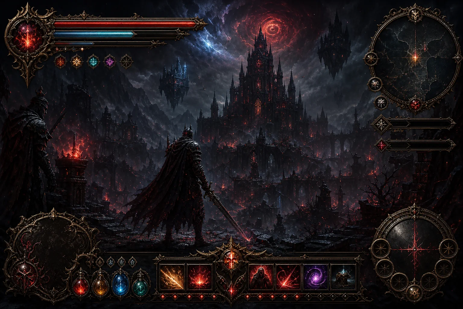
형용사 과잉
장식과 발광을 품질처럼 쌓기
황동 프레임과 이펙트가 화면 전체로 번져 정보 계층을 덮습니다. 인상적인 키 아트에는 가깝지만 플레이 시야와 상태 판독에는 불리합니다.
실제 입력 프롬프트 보기
Create a single 1536 by 1024, 3:2 landscape image. An epic, luxurious, breathtaking, ultra-detailed, cinematic, immersive and premium dark-fantasy action RPG HUD, with majestic ornate brass frames, mystical glowing ember effects, intricate gothic decorations, spectacular health and magic bars, beautiful ability icons, a dramatic minimap and highly polished fantasy interface elements. Use only blank label areas and abstract non-alphabetic glyphs. No readable text, letters, numbers, logo, watermark, border, comparison layout, device frame, perspective mockup, or existing franchise design.
 03
03
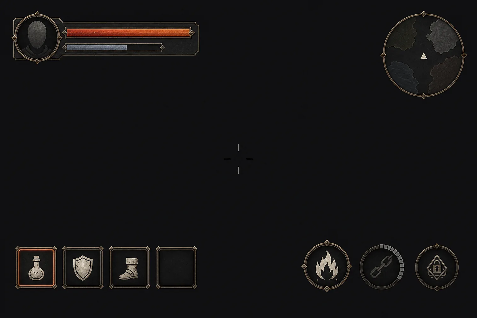
제작 명세
정보 계층과 상태를 먼저 설계하기
안전 영역·컴포넌트 크기·상태·색 역할을 고정하자 중앙 시야가 열리고 요소의 문법이 통일됩니다. 완성 PNG가 아니라 엔진에서 재구축할 방향 시안입니다.
실제 입력 프롬프트 보기
Design one front-facing gameplay HUD reference for an original third-person dark-fantasy action RPG. Show the interface flat and orthographic on a uniform near-black charcoal gameplay backdrop; no device frame, perspective mockup or tilted presentation.

Canvas and safe area: 1536 by 1024, 3:2 landscape. Keep every component inside a 64-pixel safe margin and align them to an implied 8-pixel grid. Preserve at least 72 percent of the canvas as quiet, unobstructed gameplay space, especially the central upper half.

Information hierarchy:
1. Top left: one compact player-status module, approximately 300 by 92 pixels. It contains a simple faceless circular portrait medallion, one long ember-orange health bar, and one shorter desaturated blue-grey focus bar. The two bars must share the same left edge and have clearly different value states.
2. Top right: one restrained circular minimap, approximately 150 pixels in diameter, with a thin oxidized-brass rim, four simple terrain shapes and one triangular player marker.
3. Bottom left: one horizontal quick-item group with four equal 64-pixel square slots. Show three simple pictogram icons and one visibly empty slot. Mark the selected slot with a narrow ember-orange inner stroke, not a glow cloud.
4. Bottom right: three equal circular ability icons in a shallow arc. Show one ready state, one dimmed cooldown state with a clear radial mask, and one locked state using a small geometric seal.
5. Exact center: a very small four-line reticle with low contrast. Do not add a boss bar, quest tracker, dialogue panel or decorative center ornament.

Component language: matte charcoal translucent panels, restrained oxidized-brass edge pieces, bone-white pictograms, ember orange for danger or selection, and desaturated blue-grey for focus. Use consistent 2-pixel strokes, consistent corner treatment and restrained wear. Decoration must terminate at component edges and never grow into the gameplay area. Icons should be bold, simple and readable at small size: flask, shield, boot, flame and chain motifs rendered as original pictograms.

Text handling: all label plates must remain blank. Use no words, pseudo-writing, letters, numbers, Roman numerals, fake runes or recognizable alphabetic marks. Only simple geometric dots, bars, triangles and original pictograms are allowed.

The result should look like a coherent UI art-direction sheet that can be rebuilt with vectors and engine widgets, not a finished screenshot and not an ornamental poster. Original design with no resemblance to an existing game franchise. No logo or watermark.
인게임 캐릭터 · 포스터보다 플레이 읽힘
same brief · three prompt strategies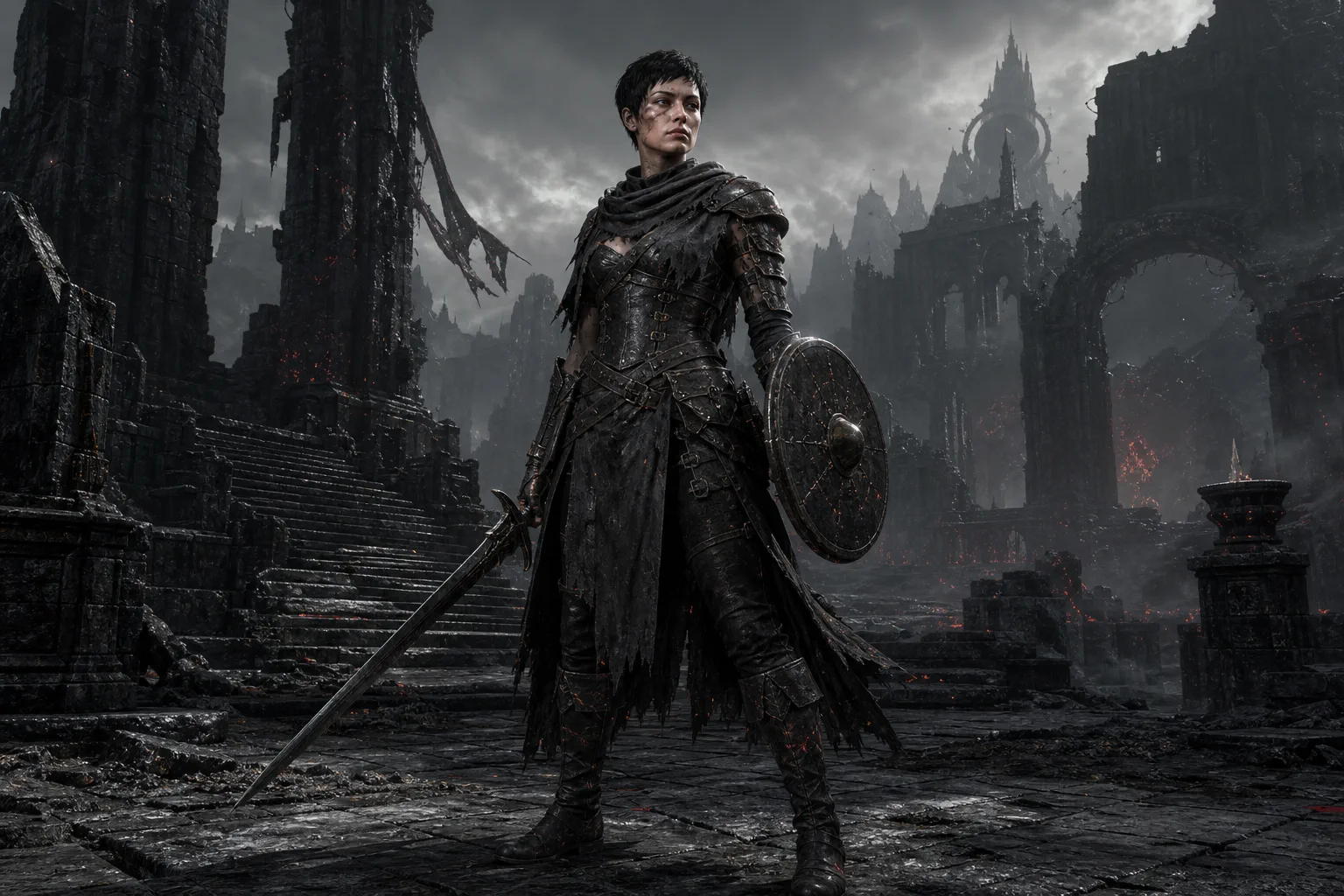 04
04
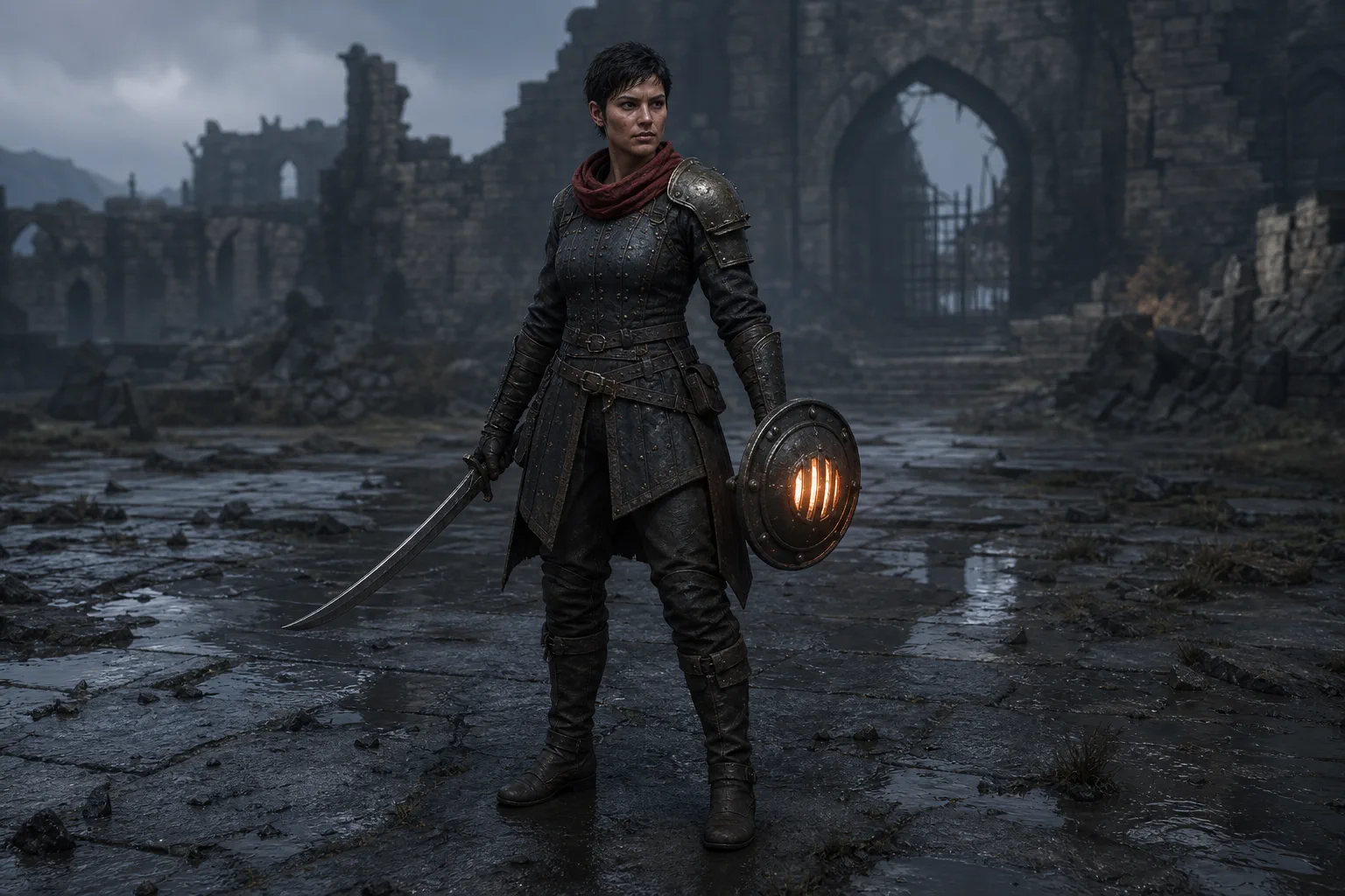
키워드만 입력
직업명과 분위기만 전달하기
분위기 있는 한 장은 나오지만 카메라·장비 기능·재질·실루엣을 모델이 결정합니다. 다음 포즈나 장비 변형을 만들 기준이 부족합니다.
실제 입력 프롬프트 보기
Create a single 1536 by 1024, 3:2 landscape game-asset image. A full-body adult female ash warden with cropped black hair for an original dark-fantasy action RPG, carrying a sword and a small shield, standing in ancient black-stone ruins, cinematic game art. One character only. No readable text, letters, numbers, logo, watermark, border, comparison layout, or existing franchise design.
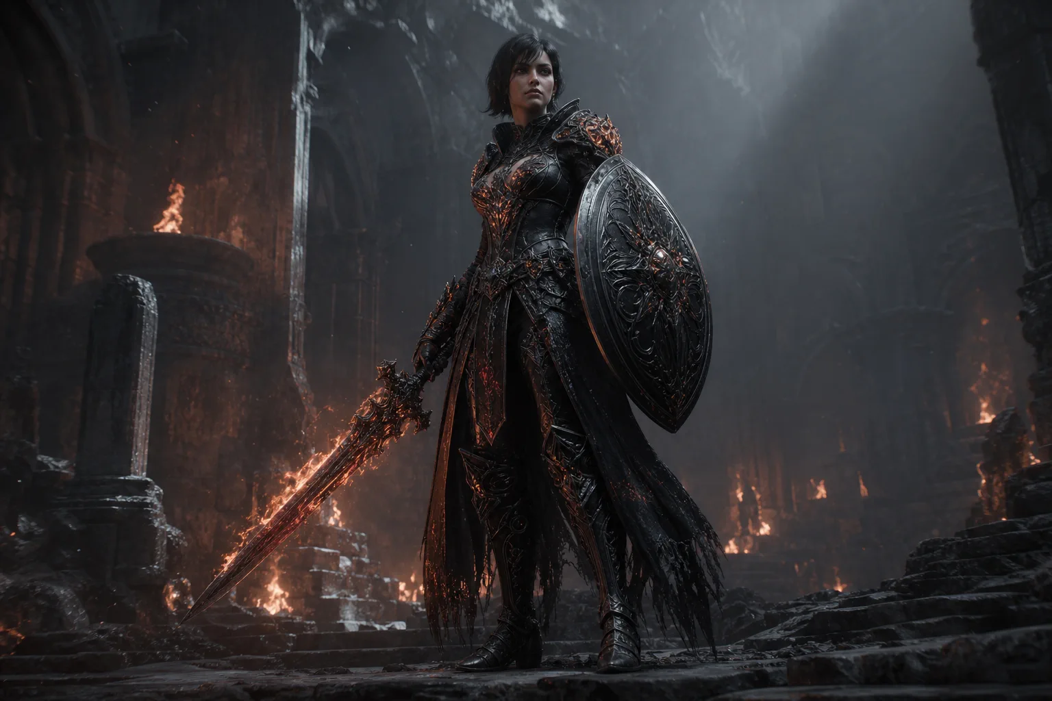 05
05
형용사 과잉
화려함을 캐릭터성으로 착각하기
장식·발광·극적인 조명은 늘었지만 검과 방패, 팔과 몸통의 경계가 복잡해집니다. 게임 거리에서는 실루엣보다 포스터 효과가 먼저 읽힙니다.
실제 입력 프롬프트 보기
Create a single 1536 by 1024, 3:2 landscape game-asset image. An epic, breathtaking, ultra-detailed, premium, cinematic, mysterious, majestic and photorealistic full-body adult female ash warden with cropped black hair for an original dark-fantasy action RPG, wearing incredibly intricate black armor with glowing ember accents, holding an elaborate sword and shield in spectacular ancient black-stone ruins, dramatic volumetric lighting, powerful atmosphere, masterpiece quality. One character only. No readable text, letters, numbers, logo, watermark, border, comparison layout, or existing franchise design.
06
제작 명세
카메라·실루엣·장비 논리 고정하기
시점, 화면 점유율, 팔과 몸통 사이의 여백, 재질 대비를 정하자 역할이 또렷해집니다. 그래도 손가락·끈·관절은 원본 크기와 후속 뷰에서 반드시 검수해야 합니다.
실제 입력 프롬프트 보기
Create a production-reference image for one original third-person dark-fantasy action RPG player character.

Subject: an adult female ash warden, lean and athletic, with cropped black hair and a weathered but natural face. She wears practical late-medieval protection: a matte charcoal brigandine over smoke-grey cloth, one asymmetrical oxidized-brass shoulder guard on her sword arm, worn black leather gloves and boots, and a short ember-red scarf as the only saturated accent. No cape and no decorative spikes.

Equipment: a plain one-handed iron falchion with a slightly hooked tip in her right hand, and a compact round lantern-shield in her left hand. The shield has a protected ember glow behind four narrow vents; the light source must have a believable housing. Both hands connect clearly to their equipment, and straps, buckles, joints and weight distribution are physically plausible.

Pose and readability: neutral ready stance, feet planted, shoulders relaxed, complete figure visible from head to boots. Keep a clean triangular silhouette with open negative space between both arms and the torso. Her face, sword, shield and red scarf remain distinct at gameplay viewing distance.

Camera and setting: eye-level 50 mm camera, three-quarter front view, character slightly left of center, full body occupying about 70 percent of image height. Damp basalt courtyard before a ruined gate. Background architecture stays soft and low-contrast so it does not merge with the silhouette.

Rendering: grounded real-time game character presentation rather than a movie poster, believable material response, restrained surface wear, overcast blue-grey daylight from the upper left and subtle warm bounce from the shield. Charcoal iron, worn leather, oxidized brass, desaturated blue-grey and ember orange palette. Original design with no resemblance to an existing franchise.

Output: one single 1536 by 1024, 3:2 landscape image. One character only. No HUD, text, letters, numbers, logo, watermark, border, comparison sheet, excessive particles, floating ornaments or fake runes.
짧은 프롬프트도 좋은 한 장을 만들 수 있습니다. 이 비교의 핵심은 미적 순위가 아니라, 다음 상태·장비·해상도·카메라 뷰를 같은 규칙으로 반복 제작할 수 있는가입니다.
생성 조건 공개
공통 조건: OpenAI 이미지 생성 도구 · 1536×1024 · 3:2 가로 · 프롬프트당 1장 · 레퍼런스 미사용 · 선택 재생성 없음 · 후처리 없음(WebP 변환만 적용). 정확한 모델명·버전과 시드 고정 기능은 노출되지 않아 성능 우열을 단정하는 벤치마크가 아닌 프롬프트별 결과 예시입니다. UI의 문자·아이콘은 최종 리소스가 아니며 Figma·벡터·엔진 위젯으로 다시 제작해야 합니다.
01
왜 예쁜 한 장은 게임 안에서 어색할까
게임 리소스의 자연스러움은 현실감보다 사용 맥락과 제작 규칙의 일치에서 나옵니다.
이미지 생성 모델은 요청이 비어 있는 부분을 익숙한 포스터·콘셉트 아트·장식적 UI의 기본값으로 채웁니다. 그래서 단독으로 보면 멋있어도 실제 HUD 위에서는 정보가 겹치고, 플레이 카메라로 멀어지면 캐릭터의 팔·무기·몸통이 한 덩어리로 뭉칩니다.
게임에서 자연스러운 리소스는 같은 질문에 같은 답을 냅니다. 선택 상태는 어떤 색과 형태로 보이는가, 금속과 가죽은 어떤 거칠기를 갖는가, 캐릭터는 어느 거리에서 얼마나 크게 보이는가. 이 답을 프롬프트보다 먼저 아트 바이블에 고정해야 합니다.
- 실제 해상도·안전 영역 없이 만든 전체 UI 화면
- 선택·쿨다운·잠금 상태가 색과 빛만 다른 아이콘
- 게임 카메라가 아닌 정면 포스터 구도의 캐릭터
- 관절과 무기 동선을 가리는 망토·끈·장식
- 배경광과 연결되지 않는 림 라이트·발광 재질
- ultra-detailed, AAA, masterpiece 같은 품질어 누적
02
게임 리소스를 통제하는 6요소
긴 문장보다 먼저 산출물의 역할과 검수 기준을 여섯 칸으로 고정합니다.
역할
01플레이어 상태 HUD인지, 보스 아이콘인지, 조작 캐릭터인지 리소스의 한 가지 임무를 씁니다.
표시 맥락
02캔버스와 실제 표시 픽셀, 안전 영역, 게임 카메라의 거리·높이·각도를 수치로 남깁니다.
읽힘
03UI의 정보 우선순위나 캐릭터의 실루엣처럼 축소해도 먼저 보여야 할 것을 정합니다.
형태·재질
04선 두께, 모서리, 패널·금속·천의 반응, 팔레트와 강조색의 역할을 공유합니다.
상태·동작
05기본·선택·쿨다운·잠금, 혹은 대기·공격·피격처럼 필요한 파생 상태를 먼저 나열합니다.
납품 제약
06투명 배경, 여백, 9-slice, 타일링, 피벗, 분리 레이어처럼 엔진 재제작 조건을 적습니다.
Asset formula
[역할] + [실제 표시 맥락] + [읽힘 우선순위] + [형태·재질 규칙] + [상태·동작] + [납품 제약]
03
UI와 캐릭터는 다르게 써야 한다
같은 아트 바이블을 공유하되, UI는 정보 구조를, 캐릭터는 플레이 카메라 안의 몸을 우선합니다.
| 설계 축 | UI / HUD | 인게임 캐릭터 |
|---|---|---|
| 첫 질문 | 플레이 중 무엇을 먼저 읽어야 하는가? | 어느 거리와 각도에서 누구인지 보여야 하는가? |
| 구조 | 그리드·안전 영역·컴포넌트 크기·여백 | 실루엣·관절 여백·무기 동선·접지 |
| 상태 | 기본·호버·선택·비활성·쿨다운·잠금 | 대기·이동·공격·피격과 장비 변형 |
| 빛과 색 | 색마다 정보 역할을 하나씩 부여 | 환경광·접촉 그림자·재질 반응을 장면과 연결 |
| 최종 제작 | 텍스트·아이콘·9-slice를 벡터/위젯으로 재구축 | 턴어라운드 후 모델링·리깅·애니메이션·LOD 검증 |
| 실패 테스트 | 실제 표시 크기와 색각·명암 조건에서 판독 | 게임 카메라와 애니메이션 포즈에서 실루엣 판독 |
04
바로 쓰는 프롬프트 템플릿
먼저 아트 바이블의 고정값을 채우고, 이번 생성에서 바꿀 변수만 남기세요.
[플랫폼·장르]용 [화면/컴포넌트]의 정면·평면 제작 시안. 캔버스 [해상도·화면비], 안전 영역 [px/%], [간격] 그리드. 정보 우선순위는 1) [핵심 정보], 2) [보조 정보], 3) [장식/배경]. [위치]에 [크기]의 [컴포넌트]를 배치하고 [기본·선택·비활성·쿨다운·잠금] 상태를 형태와 명암으로 구분한다. 형태 규칙은 [선 두께·모서리·프레임], 재질은 [패널·금속·천], 색 역할은 [기본색·강조색·위험색]. 아이콘은 [실제 표시 크기]에서 읽히는 단순한 실루엣. 모든 글자 영역은 비우고 로고·가짜 문자·원근 목업은 제외한다. 최종 이미지는 벡터와 엔진 위젯으로 재구축할 아트 디렉션 시안.
Create a front-facing, flat production reference for a [screen/component] in a [platform and genre] game. Canvas: [resolution and aspect ratio], [px/%] safe area, [spacing] grid. Information priority: 1) [primary], 2) [secondary], 3) [decoration/background]. Place a [size] [component] at [position], showing [normal, selected, disabled, cooldown, locked] states through shape and value—not glow alone. Component grammar: [stroke, corner, frame]; materials: [panel, metal, cloth]; color roles: [base, accent, danger]. Icons use bold silhouettes readable at [target pixel size]. Leave label plates blank. No words, fake writing, logo, device frame, perspective mockup, or existing franchise design. This is an art-direction reference to rebuild with vectors and engine widgets.
[시점·장르] 게임의 조작 캐릭터 [역할/직업]. 카메라는 캐릭터 뒤 [거리]m, 높이 [높이]m, [좌/우] 어깨 너머 각도이며 전신이 화면 높이의 약 [비율]%를 차지한다. 캐릭터는 [구체적인 동작의 중간]이고 머리부터 발까지 실루엣이 분리된다. 팔과 몸통, 양다리 사이에 음영 여백을 두고 관절과 무기 동선을 [망토·끈·장식]이 가리지 않는다. 의상은 [대비되는 3개 명도 그룹], 재질은 [천·가죽·금속], 포인트색은 [한 곳과 역할]. [환경의 주광원]과 [보조광]이 재질과 접촉 그림자에 일관되게 반응한다. 배경은 캐릭터보다 낮은 대비. [투명 배경/전신 여백/턴어라운드 등 출력 조건]. 포스터 구도·초상 조명·과도한 파티클·기존 IP 유사성 제외.
Create a playable [role/class] for a [perspective and genre] game. Camera: [distance] meters behind, [height] meters high, slightly over the [left/right] shoulder; the full figure occupies about [percentage]% of frame height. The character is midway through [specific action]. Preserve a readable head-to-boot silhouette with negative space between arms, torso, and legs. Keep joints and weapon arcs clear of capes, straps, spikes, and loose ornaments. Costume uses three value groups: [dark], [mid], [light], with [one accent and its role]. Materials: [cloth, leather, metal]. [Key environment light] and [secondary light] create consistent material response and contact shadow. Keep the background lower in contrast. Output: [transparent background, safe margin, turnaround, or other delivery constraint]. No poster composition, portrait lighting, excessive particles, text, logo, or resemblance to an existing franchise.
생성 이미지는 완성 리소스가 아니라 방향성과 구조를 합의하는 시안입니다.
UI의 글자·아이콘·상태·9-slice는 벡터와 엔진 위젯으로 다시 만들고, 캐릭터는 턴어라운드·모델링·리깅·애니메이션·LOD 검증을 별도로 거칩니다. 투명 배경도 가장자리와 반투명 픽셀을 실제 엔진 배경 위에서 확인하세요.
시안 승인 → 분해·재제작 → 엔진 적용 → 실제 플레이 크기 QA
05
생성에서 엔진 적용까지
좋은 결과보다 다시 만들 수 있는 규칙을 남기는 것이 제작 파이프라인의 목표입니다.
-
1페이지 브리프와 아트 바이블 고정
역할, 타깃 플랫폼, 팔레트, 재질, 선·모서리, 장식 밀도와 금지 요소를 팀의 고정값으로 기록합니다.
-
실제 맥락 캡처 준비
UI는 기준 해상도의 빈 HUD 캡처를, 캐릭터는 실제 게임 카메라와 환경광이 보이는 프레임을 준비합니다.
-
구조만 먼저 생성
UI는 패널 위치와 정보 계층, 캐릭터는 카메라와 실루엣을 먼저 확인합니다. 세부 장식은 아직 늘리지 않습니다.
-
한 축씩 변형
색, 재질, 포즈, 슬롯 수 중 한 번에 하나만 바꾸고 프롬프트와 결과를 버전으로 묶어 원인을 추적합니다.
-
분해하고 다시 제작
승인된 방향을 바탕으로 UI는 컴포넌트·벡터·9-slice로, 캐릭터는 정면·측면 설계와 3D 파이프라인으로 넘깁니다.
-
엔진 안에서 실패 조건 검수
실제 해상도·배경·전투·애니메이션·밝기에서 읽힘을 확인합니다. 에디터 밖의 큰 이미지로만 승인하지 않습니다.
06
엔진 적용 전 마지막 체크
큰 원본이 아니라 실제 표시 크기와 플레이 맥락에서 답할 수 있어야 합니다.
- UI가 실제 표시 크기에서도 정보 우선순위와 아이콘 의미를 유지하는가?
- 선택·비활성·쿨다운·잠금이 색 하나에 의존하지 않고 형태·명암으로도 구분되는가?
- 글자·아이콘·9-slice를 편집 가능한 원본으로 다시 제작했는가?
- 캐릭터의 머리·팔·무기·다리가 게임 카메라 거리에서 분리되는가?
- 망토·끈·장식이 관절과 공격 동선을 가리지 않는가?
- 발의 접촉 그림자와 재질 하이라이트가 환경광 방향에 맞는가?
- 정면 한 장뿐 아니라 측면·후면·상태·포즈 파생에서도 아트 규칙이 유지되는가?
- 손·스트랩·겹침·투명 가장자리·가짜 문자를 원본 크기와 엔진 안에서 검수했는가?
참고한 공식 가이드
프롬프트 구성은 생성 도구의 공식 가이드를, 실제 리소스 재제작과 검수 항목은 Unity·Unreal의 공식 제작 문서를 기준으로 재구성했습니다.
예쁜 결과를 요청하지 말고, 게임 안에서 지켜야 할 규칙을 요청하세요.
UI는 정보 계층과 상태, 캐릭터는 카메라와 실루엣, 둘 모두는 팔레트·재질·납품 제약. 생성은 시작점이고 자연스러움은 엔진 안에서 완성됩니다.